LS Staging

Tag: mobile seo

  • Google’s new AMP testing tool: What you need to know.

    On 13th October, Google announced the launch of a new testing tool for accelerated mobile pages (AMP). The tool works on mobile devices with the help of Google’s ‘live web search infrastructure’ and analyses the AMP pages real-time using Googlebot. The tool helps with testing the validity of structured data and markup on the page.

    It also has links that show a live preview of how the page appears in Google’s search results, and if you find any issues, you can click on them to see the source code and understand where the errors lie. You can check your site here: https://search.google.com/search-console/amp

    Source:

    https://goo.gl/1fhaKw

    https://goo.gl/xYa7wa

  • Google announces Accelerated Mobile Pages (AMP) will trump App Deep Links

    Google announces Accelerated Mobile Pages (AMP) will trump App Deep Links

    Speaking at SMX East, held recently in New York, the head of Global Product Partnership at Google, Adam Greenberg revealed that AMP pages will “override app deep link”. For example, if you are a publisher whose website has AMP (Accelerated Mobile Pages) URLs activated and if you have a mobile app with Google App Indexing, users who download your app will be able to view the AMP URL instead of the deep link to the content contained in your app.

    amp_google_deep_linking

    Google’s Senior Webmaster Trends Analyst John Muller too confirmed this statement by tweeting—

    Recently, Google was in the news for carrying AMP to the core mobile search results. However, the tech giant was quick enough to make notable changes to its project soon after the rollout. As per the changelog, AMP will override app deep links.

    Google has taken several initiatives over the years to promote App Indexing by encouraging app developers to incorporate deep links to their apps along with App Indexing. But presently, if you have deployed both AMP and App Indexing to your website, Google search results will prefer to show the AMP pages above the deep link to your app pages.

    What Made Google Update Its Changelog Soon After the Rollout?

    Reiterating on the immediate and quick update, Google said that they have taken this decision because AMP helps them deliver their services in a better way because of its reliability and speed, besides helping Google enhance the user experience. The tech giant further said that Accelerated Mobile Page uses ten times less data compared to a non-Accelerated Mobile Page. Moreover, AMP utilises smart caching to ensure content and advertorials are displayed flawlessly.

    LogicSpeak:

    As mentioned above, Google believes people like AMP pages as they load pretty fast and consume 10x less data compared to non AMP pages. To provide a faster experience, Google is planning to show your AMP pages over the deep link to the page. In simple terms, if your user has downloaded your app and you have the deep linking in place; at the same time if you have created AMP pages, Google will serve the AMP pages above the deep link to your app pages. This can reduce traffic to your app pages.

  • Google continues its efforts to make the web more “mobile-friendly”.

    Google makes web mobile friendly @LogicserveDigi

    On 16th March’16, Google announced on its official blog that from May’16, it will start rolling out an update to its mobile search results. The update will help in increasing the effect of the ranking signal. This will help users find even many more pages that are not only relevant to the user’s search, but also mobile-friendly.

    Last year, on 21st April’15, Google had announced that it would be rolling out mobile-friendly updates to include it as an important component of page ranking. It will roll out gradually, hence there won’t be an immediate drop in the no. of pages that aren’t mobile friendly which would be visible on search results immediately.

    Search Engine Land states that since the update is a “page-by-page” signal, it can take time for Google to access each page. Hence, the update will be gradual.  However, it is unclear how much time it would take to be rolled out completely.

    Google goes on to mention that if your site it already mobile-friendly, this update will not have a major impact as it did, when it was rolled out for the first time.   I had listed out the parameters last year, you can check it here.

    Mobile friendly test Google @LogicserveDigi

    Now, how do you know if your site is mobile- friendly? Well, Google has its own tools that will help you to know if your site is mobile friendly or not.  You can check your website’s mobile-friendliness here.

    Mobile Friendly Test Tool @LogicserveDigi

    You can read more about how to make your site mobile friendly here.

    Google Mobile Friendly @LogicserveDigi

    LogicSpeak: Mobile search has already superseded desktop queries. While Google had already cleared its stand on importance of ‘mobile friendly’ websites in the Google Algorithm, another roll-out in the month of May would certainly bring more importance to mobile-friendly sites. Apart from improving the mobile amiable factors on your site, pay equal attention on creating quality content. Amalgamation of both would bring you better results.


  • Facebook Partners With Google To ‘Deep Link’ Its App For Android Users

    FB unfriend facebook @LogicserveDigi


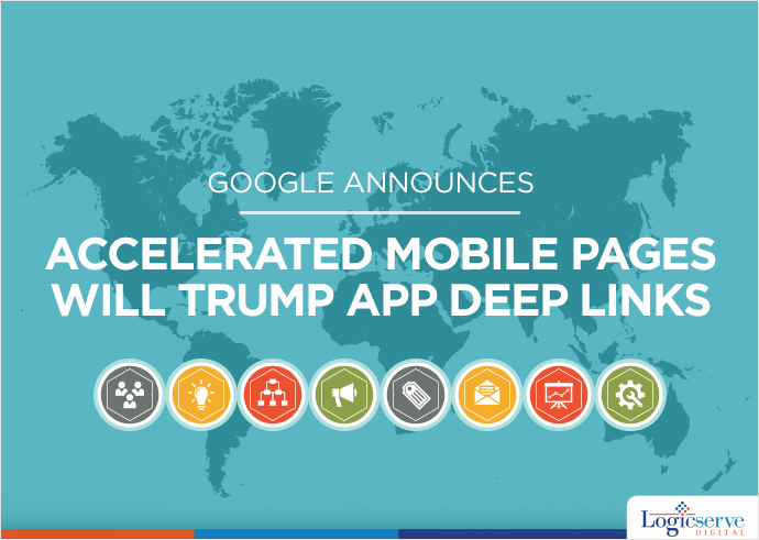
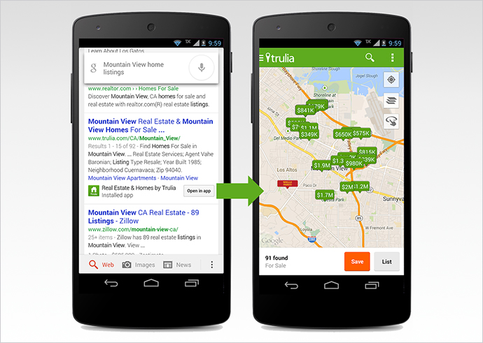
    To make the mobile search feature more appealing for the users, Google, the largest search engine has started ‘deep linking’ the apps on its search results. ‘Deep Links’ allow the user to directly jump on the relevant page on the mobile app, which is already installed in his mobile, from the search results. It means, when a user searches for publicly available data on the website and clicks on the search result he can directly launch the relevant page of the app, provided the app is already installed on his phone. Earlier, when users clicked on the search results, in spite of having the application in the phone, they were taken to the login page of the mobile version of the website.

    deeplink @LogicserveDigi

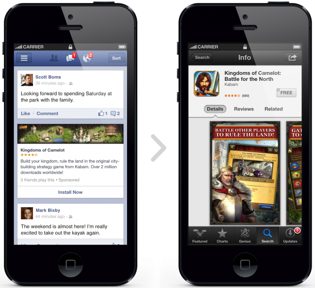
    Now that Facebook has partnered with Google to crawl and index its mobile app, the users searching for Facebook’s publicly available information can jump directly on the required page of their already installed app by clicking on the search results. This means, the users will not be directed to the mobile web page of the social networking site for login.

    Only the apps that have corresponding content to a web page can enjoy the benefit of App Indexing. Currently, this service is not available for the apps that do not have a web page.

    By implementing the Google’s App Indexing service, Facebook has certainly bridged the gap between search on the web and apps. Moreover, it also justifies the objective of Google to make the search results relevant.

    Thus, it turns out to be a win-win situation for all those who are concerned with this development. For Google, it is a great way to improve the experience of its mobile users, for Facebook it is an opportunity to get users to spend more time on the app and for the users it is a time saver that bypasses the login process, allowing them to access information instantly.

    facebook mobile ads @LogicserveDigi

    Earlier this year Google introduced App indexing for Android apps and later also for iOS apps. This enabled users to get information from the deep links and search results displayed within the apps indexed by the search engine. Initially, this service commenced with a few apps, and was soon released among other app developers who wished to get their applications indexed. Though the agreement between Facebook and Google is limited to Android right now, we can soon expect it to extend to Facebook for iOS app.

    Users need not worry about disclosing their private content to Google. This is because, though this development gives Google the right to use more information, it cannot access the content that is private or requires user login. To get access to the private content users can use Facebook Search, the recently updated service of the social networking giant. Thus, the search results are confined to the content that is publically shared.

    Well, even Twitter users can enjoy similar hassle-free browsing experience, for recently, Google has also partnered with Twitter to display relevant tweets directly from its search results and apps.

    LogicSpeak

    “With Facebook now opening upto Google, this is good news for users. At present, if you search for a friend’s name on Google, while the Facebook profile page might be one of the first links, it won’t take you straight to the app. The link instead opens a mobile version of the Facebook site and does not reflect any information about that particular profile. Also the listings are restricted to profile pages only.

    However with this new deal, public posts, photos that are public, etc will also be reflected in Google’s mobile search. Though this will decrease the number of visitors on Facebook website, it will shorten down the search time for any user. Let us see how this deal progresses in the future”

    At present, if you search for a friend’s name on Google, while the Facebook profile page might be one of the first links, it won’t take you straight to the app. The link instead opens a mobile version of the Facebook site and does not reflect any information about that particular profile. Also the listings are restricted to profile pages only.

    However with this new deal, public posts, photos that are public, etc will also be reflected in Google’s mobile search.

    Reference: https://goo.gl/fw0YpW, https://goo.gl/fPMem7, https://goo.gl/bUF9fd , https://goo.gl/qAM5bq

  • Tips to Improve your Mobile Search Performance

    These days a mobile phone is the principal source for experiencing the internet. So it’s crucial for the establishments which promote their products online, to build a mobile-friendly website. As if you fail to build one then surely you lose a buyer with each search on internet through mobile devices. The experience phone operators would have on your site is way too different from the desktop version, which means it would cause completely different problems which the internet masters need to pay attention on. Thus here are few tips to start with for you to build your site as a mobile-friendly site.

    1. You should check if your site is a mobile friendly site by using Google “Mobile-friendly test” which would also display the way it appears on devices. This way you would also get aware of elements which can’t be loaded. So this is a kick start to build a mobile integrated site.

    Create a mobile integrated site

    1. Then comes designing the pages, you should ensure that all the most important elements which you want to make visible to the users need to appear at the top section. As a buyer won’t spend time scrolling down the bulk pages. Also the design of the page should be calculated to ensure that it fit into the screen size. Here you need to note few important aspects to enhance the designing such as using compact and small size images for quick loading, using keywords for description to make it crisp, adding icons such as ‘add to wish list’, ‘buy now’, ‘add to cart’, ‘search option’, etc. and to use product page to show all the required information such as delivery details, dimensions and other specifics.

    For instance, Amazons mobile site includes all these items displayed.

    Amazon mobile site buttons

    1. Verify your content to confirm what’s workable in your site on mobile devices or not. Presuming that every matter would be operational is wrong to assume. So videos need to be checked especially as few videos are jammed from replay or use formats not accepted on mobile devices. Similarly many images and matter are also blocked for not being in the required format so it’s mandatory to scrutinize all the content. Burton and Dadaab stories are two mobile sites which share a lot of content wisely. In the case of Burton, despite all the images and videos which work well, the speed is uninterrupted with the amount of matter shared.

    mobile search optimisation


    1. It is a controversial topic to decide whether ads need to pop up before the content on the main page is made visible. Generally sites in which ad pop ups leads the customer to the site’s mobile app are not considered appropriate. As the customer doesn’t appreciate such sites with ad’s and app requests. So you could be patient enough and include such tags in the upper section of your page. Also redirecting to your mobile site from Google or desktop site ensures the programming is correct and doesn’t lead the buyer to various other non-significant pages. This might make the customer loose interest due to confusion. Another thing is to ensure that the back links from your site should take the customer to appropriate pages. 404 pages should also be avoided for mobile-sites. IFC showcases plentiful of information through its page in an organized manner. It links you to pages further which are associated to its series directly. This efficiency needs to be hence maintained.
    1. Most important is to know that resolution of the mobile site varies drastically in comparison to the desktop site. So for mobile site’s you could use this advantage and put up a site with less heavy and compact content which works even in the sluggish and untrustworthy internet connections.

    Nixon and salesforce belong to the category of such mobile sites which not only are responsive but load with fast speed.


    Search engine friendly mobile site

    1. You should also enhance your Google local webpage for your mobile site to make local exploration more exact and unambiguous. To do so submit your contact details and in particular your contact number and also include customer reviews on the page. The global ecommerce sites should chiefly work on their local sites and the way the content is shown locally.


    LogicSpeak:

    Make your ecommerce site a fully responsive mobile friendly site. In this era of portable gadgets, a superlative mobile search performance will make you soar higher towards success.


  • Google Mobile Friendliness – Important Parameter for Ranking Higher

    Google Mobile Friendliness – Important Parameter for Ranking Higher

    Google Mobile Friendliness @LogicserveDigi

    Google has finally decided to accord mobile-friendliness along with indexed apps the importance from a ranking perspective, after a long period of testing. They have recognized that you are making more use of their mobiles to surf internet and want to reward sites that are mobile friendly by ranking them higher.


    New Algorithm

    A new algorithm will come into play from April 21 and this would impact mobile searches globally in all the languages. Google has suggested that you as a webmaster should prepare for this change by taking the mobile friendly test and check out the mobile usability of your site through the Mobile Usability Report in the Google Webmaster Tools.

    In addition, Google will with immediate effect regard all information from the indexed apps as one more ranking factor to decide search engine ranking of sites. All signed-in users like you that have installed the apps will benefit from this and more importantly content from such indexed apps will also rank higher for relevant queries than before. It becomes therefore imperative for app developers like you to now strike a relationship between their own Web pages and the app links they point to.

    Two Improvements

    Following this development, you will now get relevant as well as timely search results on your mobile devices and it will not matter where that information resides – on the apps or on the web pages. Google said that as compared to their earlier update algorithms that focused on site configuration, this new one will be enable the following:

    1. Help you find sites that are mobile friendly within the search results. It will have an impact across languages globally and you will now find it much easier to get the results that are fully optimized and suited to display properly on their devices.
    2. Most appropriate and relevant app content will feature in the search results. Google will use the data they get from all indexed apps for this purpose. This will enable them to push such content more prominently and ahead of others to provide full value to you as the visitor to that site.


    Be Mobile-Friendly Or Perish

    This debate on whether a mobile-friendly site was necessary for a winning SEO strategy has been going on for some time. But this latest announcement from Google signifies that if you as a webmaster cannot make the necessary changes to make this transition, you could lose out big time. Unless you are able to put forth a mobile-friendly site by April 21, you will suffer loss of ranking.

    This initiative was expected as even recently Google was encouraging webmasters to make sites mobile-friendly, sending out notifications through their GWT. They also added the mobile usability report and launched the mobile-friendly testing tool within the GWT as clear indicators of their intentions.

    More and more sites will now race against each other to fulfill this requirement. Those of you are already there will benefit earlier. It is clear that only mobile-responsive sites will get the preference from search engines like Google for ranking as it is believed they provide a much better user experience.


    Previous Post: How to Measure B2B Content Marketing Outputs

  • Is your website geared up for mobile usability

    Is your website geared up for mobile usability

    There have been instances of websites receiving mails from Google and notifications through Webmaster Tools stating that they have to become mobile friendly if they wish to perform well on the mobile platform.  At the same time, this hints at mobile ranking which could affect their site visibility in the near future.   It is very much possible that Google may be launching a mobile ranking algorithm soon wishes to get as many as sites mobile friendly by the time it is actually launched.

    Google mobile optimisation @LogicserveDigi

    Since last November, Google has gone ahead and launched mobile friendly testing tool, mobile usability reports in Google Webmaster tools including mobile friendly labels in search results.

    Getting on the basics of Mobile Usability

    As a preferred search engine, Google is committed to display not only useful but accurate information to the search queries. The emerging preference for search through mobile phones especially the smartphones highlights the need for websites to adapt to the mobile interface as soon as they can.

    Apart from being affected by likely to be launched Google Mobile Ranking algorithm, websites may face visibility issues in the mobile platform soon, if they do not adapt to it soon.  Websites can access the mobile usability report offered under the Search Traffic section which identifies the errors page wise of your website assisting you to resolve them in the right manner.

    Key Adaptations required include –

    Defining a viewing area a.k.a viewport – The pages of your website need to define the meta viewport tag which directs the browser to adjust the web page’s dimension as per the device screen through which it is being accessed.  This is important as there is vast range of devices through which websites can be accessed.

    Content flow visible in the viewport – If this point is highlighted in your report then you should define a relative width and position values for CSS images, including images which ensures that the web pages are displayed through a horizontal scroll for a better display.

    Suitable Fonts and their size – A mention of this point in the report suggests on which pages you need to make changes in the font size ensuring their readability. Once done, the viewers will no longer require to ‘pinch and zoom’ content for reading the web pages.  Remember to specify the viewport which could solve the scaling of the font size just perfectly.

    Well defined and spaced out Touch Elements – The touch elements offering further entry into the websites should be well spaced and kept in the eye view which ensures their visibility and use too. If at all, this point gets highlighted in the mobile usability report than you need to pay attention to suggested URLs wherein the space buttons, touch elements along with the navigational links are well spaced and placed for further use.

  • How essential is it for you to go mobile?

    How essential is it for you to go mobile?

    SEO Mobile site @LogicserveDigi

    With trends revealing increasing browsing activities through mobile phones especially smartphones and tablets, it becomes inevitable to have websites which are easily accessible with the mobile platform and interface. Digital marketing experts strongly believe that internet traffic through mobile is going to increase manifold. For quite some time now, SEO experts have been advising clients a dedicated mobile site to capture the incoming traffic while being search engine friendly too. Hence, it makes sense to invest in online products and channels wherein the purpose of attracting traffic online is solved and to a great extent attracts conversions too.

    Though for some, this predication is skeptical but likely to be quite accurate. There have been arguments stating the mobile technology is new and customers are likely to take time to adjust. Conceding the fact that many established online portals have proceeded to offer the same to their customers/visitors, it is time online businesses do give it a serious thought.

    In fact, Google has recorded increasing number of visitors making purchases through their smart phones along with the fact that more than three quarters of the online visitors made a purchase online. Emphasizing on the undertones that despite the presence of the desktop, users found accessing the sites through their mobiles/smart phones easier and much more convenient which does relate to gearing up new strategies and developments. It’s time ecommerce retailers sit up and adapt to this trend as soon as they can.

    Trends reveal that users prefer to access information, shopping deals, reviews and other related information through their in hand mobile devices especially when they are on the move and about. Consider it as an activity which keeps them engaged or provides them with vital information at their fingertips, a time saving activity

    Thinking of proceeding with the development of a mobile site? Well, the most popular options are either you have an entirely different site to cater to mobile visitors or you could develop a mirror image of the website which is smaller than the desktop site or an entirely different site. On the overall, make sure you have site which serves the purpose of your mobile visitors and is quite responsive too.

    Whilst planning a mobile website, website owners need to analyze and arrive upon the following parameters –

    • Goal of mobile website – offer information or encourage conversions
    • Extent of content offered – use the same content or have a different content
    • Analyze Visitor Traffic – study the activities of visitors on mobile website before proceeding

    From the SEO perspective, having an entirely different site catering to queries and requirements through mobile phones works in a great way rather than slightly tweaking an existing desktop site to suit mobile traffic.

    Responsive Sites

    Since both the sites, desktop as well as mobile are pretty identical, owners will need to update a single set of content. Bear in mind, content will be viewed on a smaller screen when accessed through a mobile as against the large screen of the desktop PC. In fact, by offering more compatibility these websites are known to perform much better. They could even build up responsive sites bit by bit and study its performance in a similar pattern. This helps you make it even more responsive as per the traffic analytic reports.

    The other alternative is to make a separate but an identical site with same URLs for mobile use but make sure the site is dynamically served on to the mobile devices when accessed. This means the issue related to broken URLs is taken care of.

    Many a times, visitors could be complaining of content loading issues on the mobile device but then it pays to have concise content which does reduces the loading time too. Images are dynamically served as per the screen size of the mobile device which makes things even more convenient. Use of simplified Java Script or switching over to HTML 5 is advisable as it helps the website to function in a better manner.

    Separate mobile sites

    Separate sites do have a definite edge over responsive sites for they can tailor made to cater to specific requirements of mobile visitors. This means they can be very different and tweaked to include keywords while adapting to mobile search engine parameters. The main desktop site is left untouched while developing a new mobile site offers the much required flexibility to innovate and try out new ideas too. Don’t miss out this opportunity to be creative to the best of abilities and try them on an entirely new platform.

    For survival of any business, online or offline, being dynamic is essential. Hence, adapting to new environments such as mobile platforms becomes the need of the hour. By launching a mobile website parallel to the desktop site, visitors and relevant traffic is taken care of to a great extent.

    LogicSpeak:

    The number of users accessing the web on their mobile devices has dramatically increased. This is because of the availability of more affordable smartphones in the market. Mobile devices are no longer just for basic texting and calling. They are used almost the same way as computers. This is the reason why mobile websites are vital for businesses that would like to build their presence online.